Branding
Project 1:
Brand Definition
Inheriting the marketing functions at Counsel Press after a pandemic-driven slowdown for the company’s marketing, I was glad to leverage the strong branding identity already in place, introduced by my predecessor in the role. I worked to standardize the navy and gold color palette across all collateral, aligning creative asset design under a cohesive and recognizable visual style.
A fresh blue color, Wave, was introduced as part of the Counsel Press website redesign project in 2025, evolving the creative range of marketing materials for the company with a bright, attractive new tone.
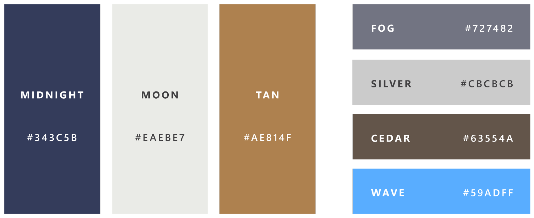
Older marketing materials created for Counsel Press utilized the Unna, Medio, and Butler fonts, whose singular font weights limited the variety in typographical design. I worked to introduce Minion and Proxima Nova as new primary and secondary fonts. The serif’s elegance and the sans serif’s modern readability, as well as their range of weights, helped develop fresh, professional, and eye-catching promotional collateral.

Playfair replaced Minion as primary font during the website redesign, with Metropolis serving as the site’s body copy font for best web accessibility.
Project 2:
Signature Blocks
Leveraging my HTML/CSS coding and technology management skills, I designed a new layout for Counsel Press’s companywide email signature blocks.
Aligning with the newer color scheme, the new signatures were now mobile-friendly and conscious of varied email client functionality, composed with optimized type and information hierarchy in mind, as well as minimally compact and visually unintrusive for lengthy stacked email exchanges.
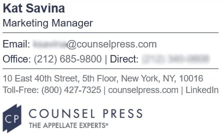
In collaboration with in-house IT resources, I assisted with the implementation and launch of a new email signature management platform for the company. Post-launch, I continued to manage the data remediation and design maintenance duties for existing and new staff, as well as creating brand-aligned variations of the signature blocks for company acquisitions.
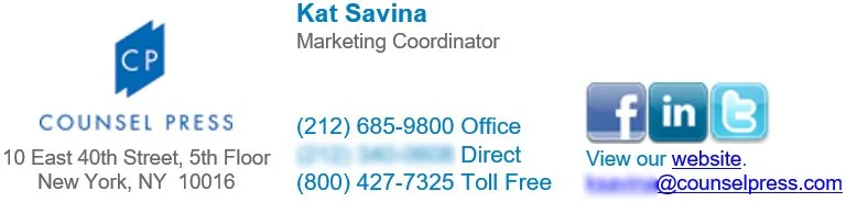
This decades-old signature block design was not responsive, the layout breaking erratically when displayed on mobile.

Project 3:
Merchandise
Serving a clientele in the legal space with an affinity for high-quality product, I wanted to create merchandise/”swag” items that stood out in a sea of basic giveaways with just a logo stamped on them. I was seeking a concept that would resonate with booth visitors at conferences and smaller promotional events, creating items that lawyers would be enticed to take home and be thrilled to use every day.
Bringing a touch of humor and personability to my work, I created the I’m Appealing and Keep It Brief designs to be printed on totebags and as stickers.
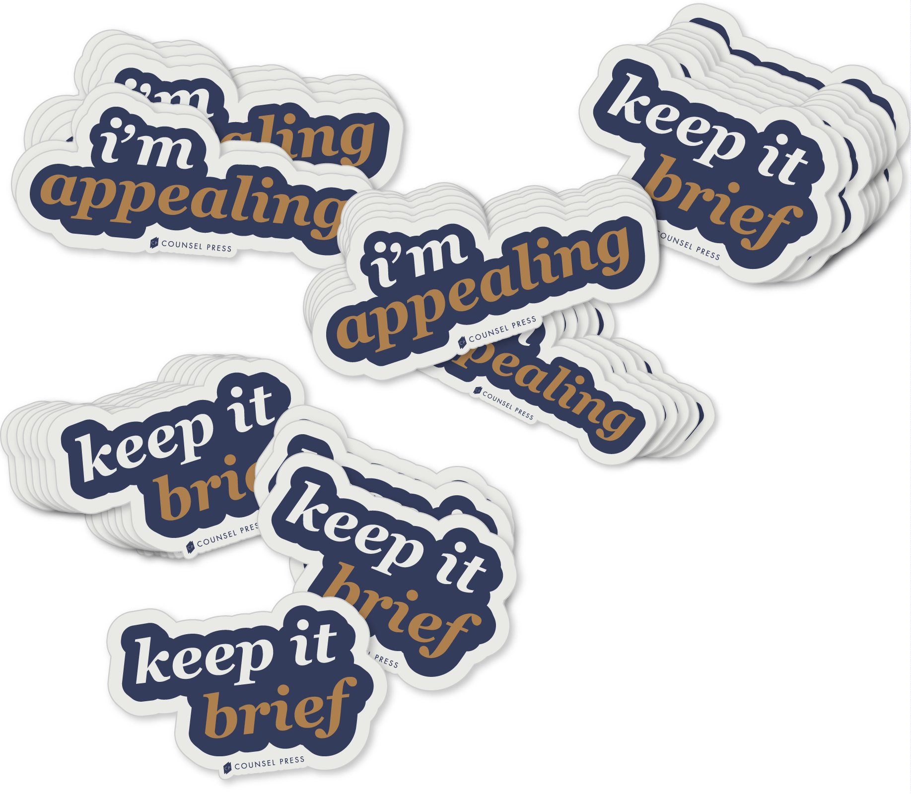
With a tongue-in-cheek take on the niche work Counsel Press and its clients performed daily, the merch items were an instant hit as marketing event giveaways. Lawyers expressed a warm affection for the clever nod at filing appeals and crafting appellate briefs, excitedly seeking out these swag items for the lighthearted and personable way to express pride in their chosen career specialty.
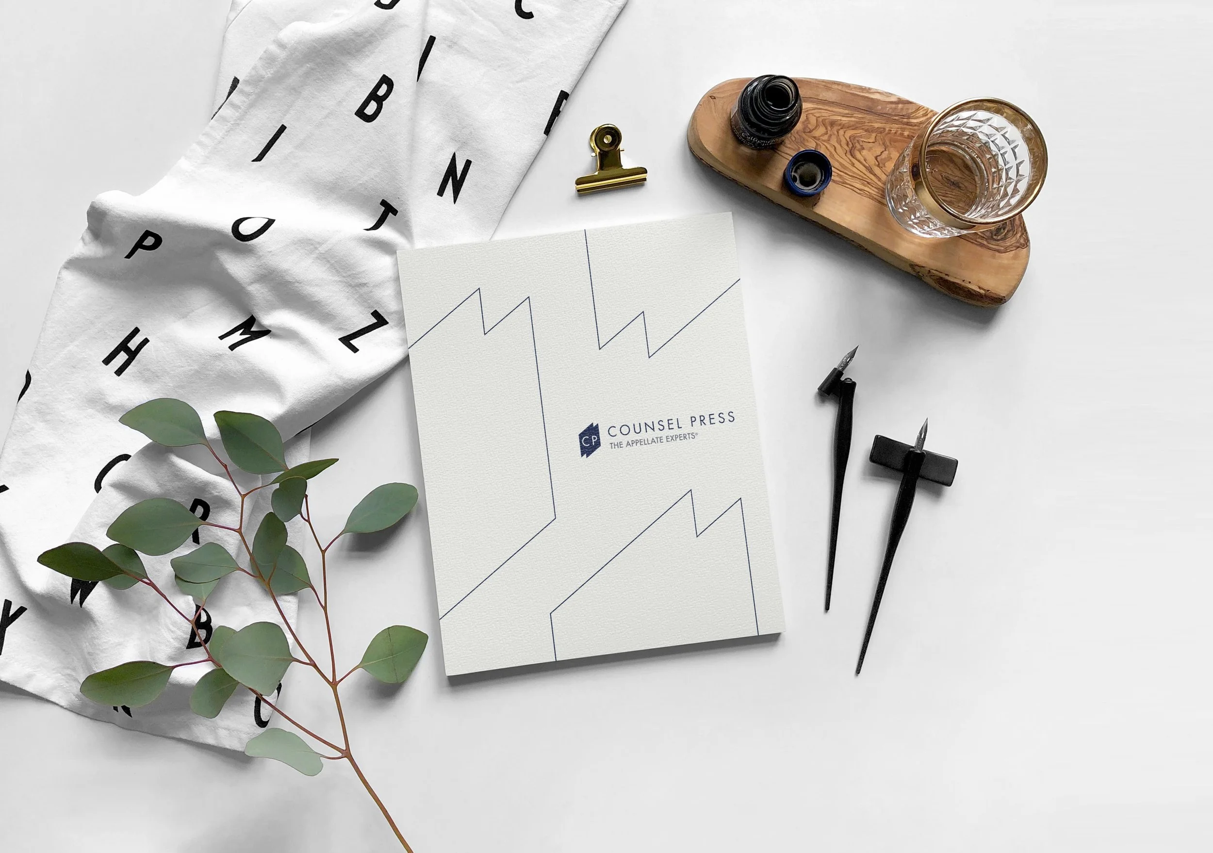
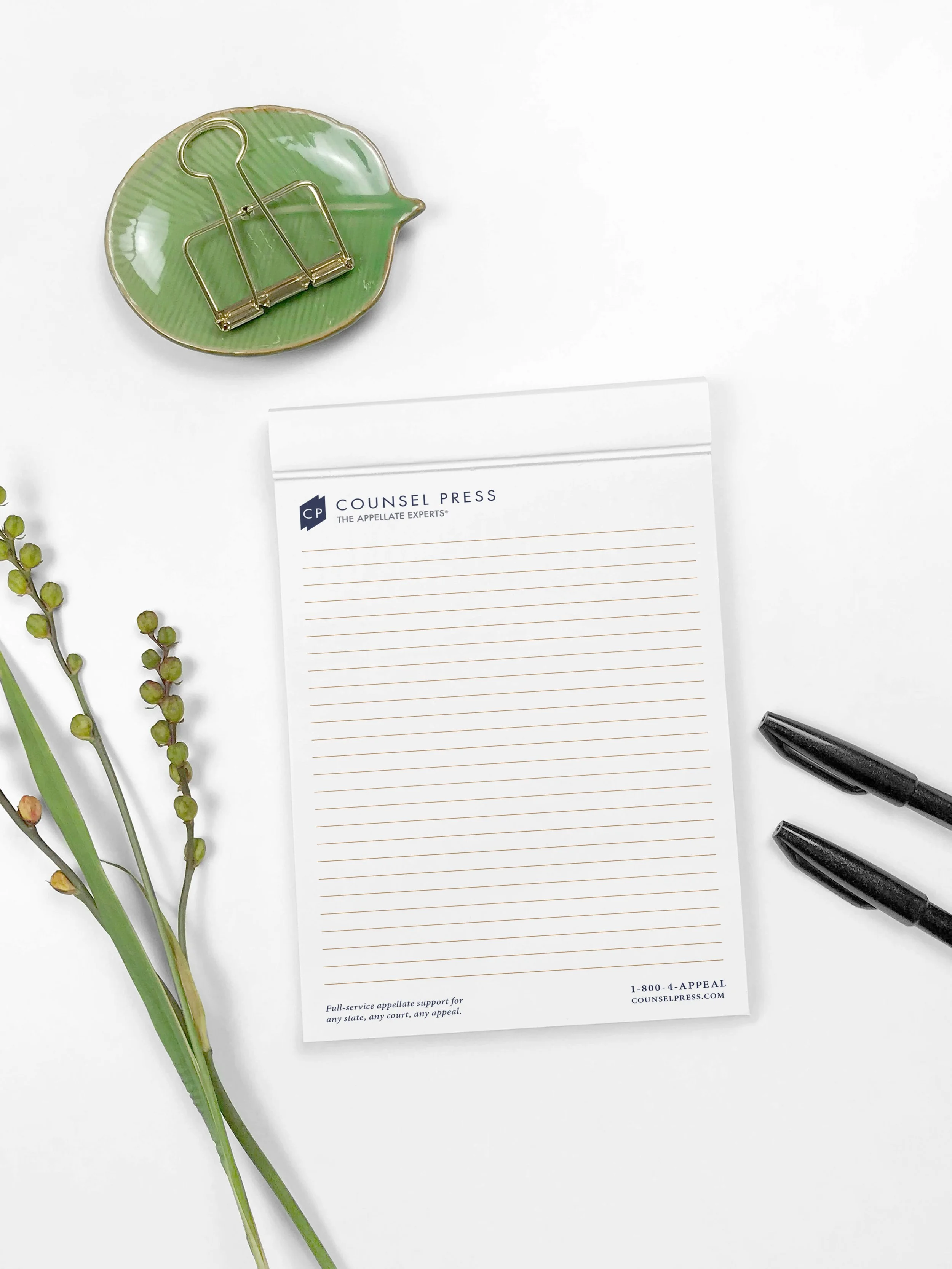
Inspired by Counsel Press’s state-of-the-art printing facilities at its NYC headquarters, I collaborated with the print production team to begin manufacturing small branded notepads to serve as marketing giveaways.
Having designed the cover and page layouts, the team printed and bound the notepads in-house and on-demand, crafting a cost-effective merchandise item that showcased Counsel Press’s expert print production abilities.
Mockup PSDs licensed from Mr. Mockup