Branding
Project 1:
Brand Definition
As a brand, Kraft Kennedy initially lacked consistency in color scheme and font selections. Styles often varied greatly between the website, printed collateral, advertisements, and slide presentations. Blue and gray were the main color combination to shape the branding, but the shades used were not consistent.
In 2017, I standardized the primary color selection to one Kraft Kennedy Blue, mainly often paired with simple white, and the grays remained as optional secondary highlight colors.
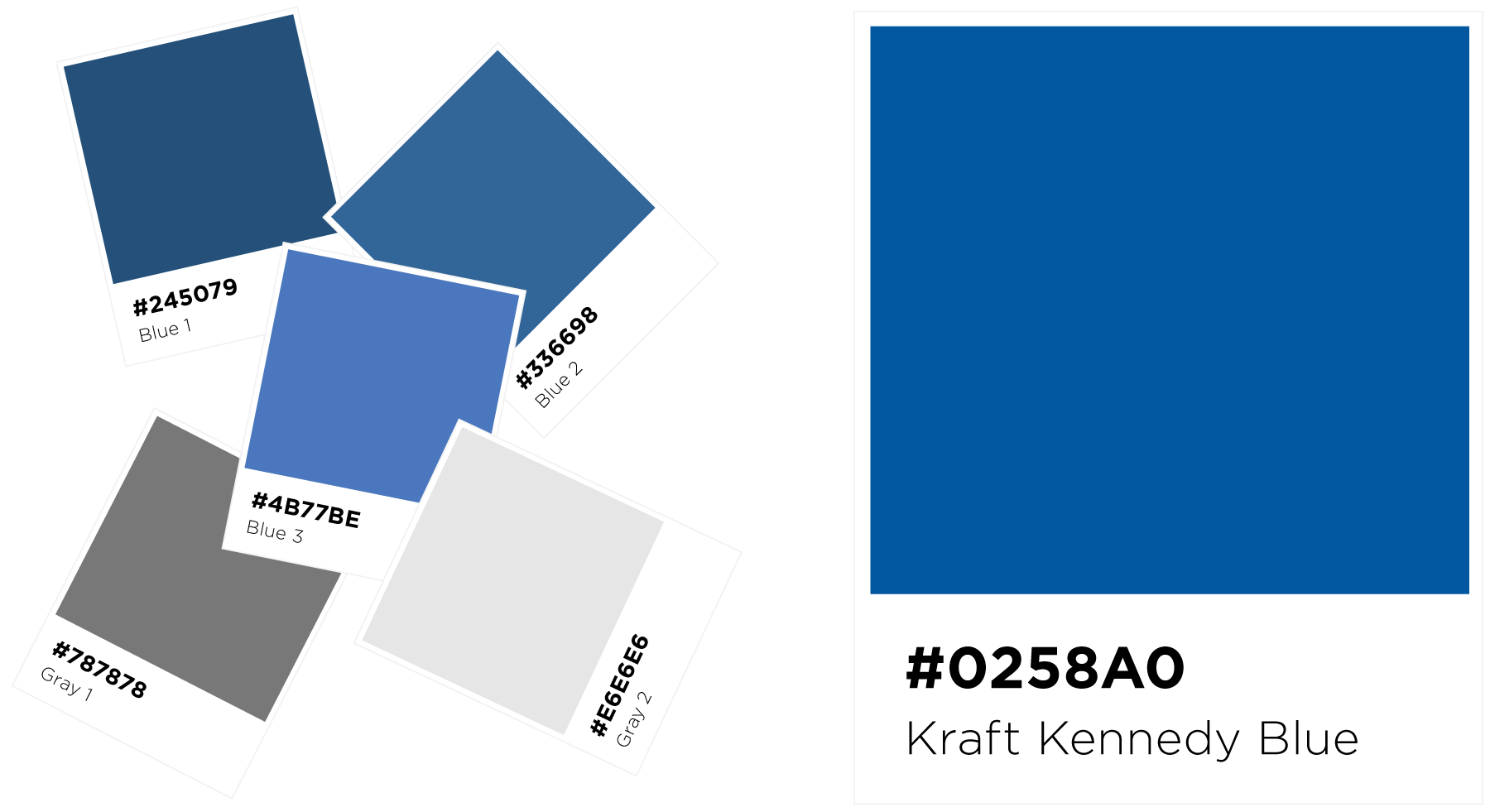
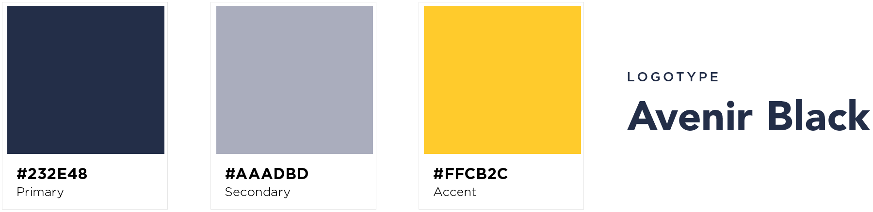
In 2021, Kraft Kennedy underwent a branding expansion effort in conjunction with a major website redesign project. Additional color selections were required to bring a touch of freshness and modernity to the new brand.
A rich navy became the new primary base for the evolved color scheme, with a soft sky blue as an accent, and a touch of bright yellow to bring attention to actionable items on the website.

Over time, I worked to introduce the Gotham font family as the new primary font selection for all promotional collateral. Its readability, contemporaneity, and range of weights made it a great choice for producing marketing material.
Avenir, the font making up the original KK logotype, remained an alternative choice for body copy text on long-format works.

Project 2:
Website Redesign
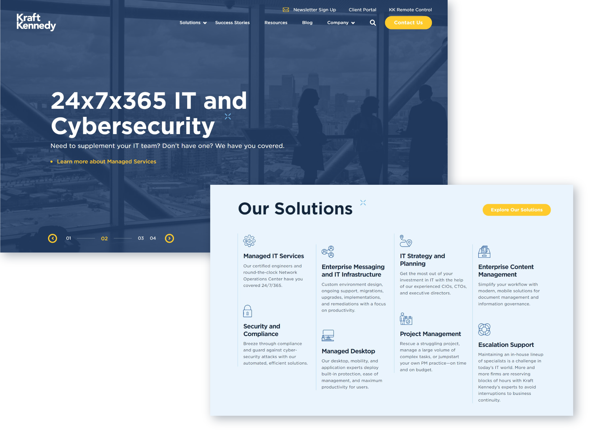
Completed and launched in 2021, this project marked Kraft Kennedy’s first major website overhaul in seven years. Rooted in a refreshed color scheme and font selection, the new site is a colorful maturation of the company’s 30-year legacy, and a bold step into the future.
-
![]()
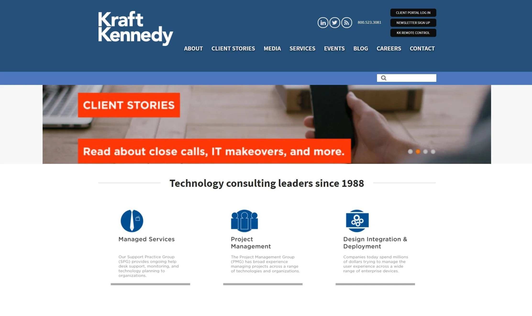
Homepage, 2019
-
![]()
Homepage, 2022
-
![]()
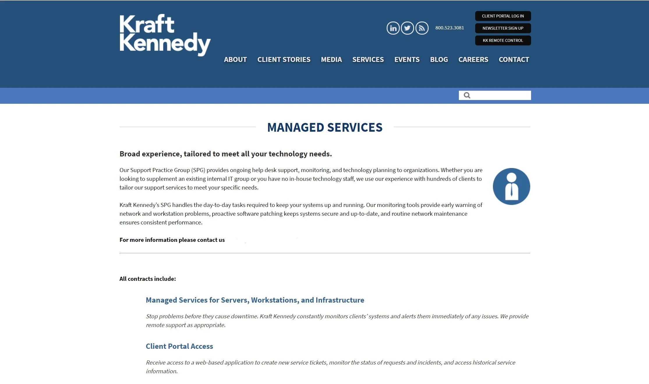
Service Description Page, 2019
-
![]()
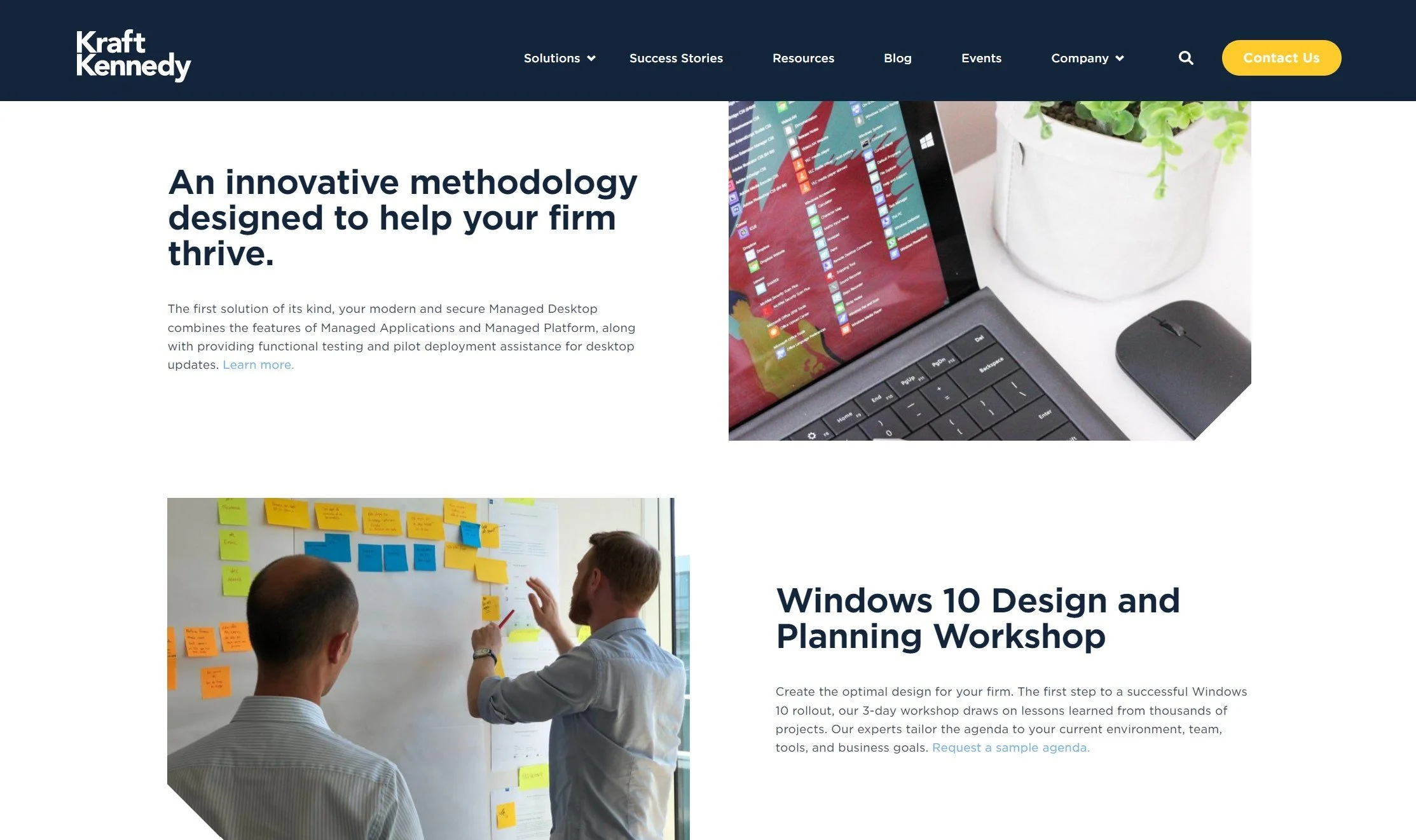
Service Description Page, 2022
-
![]()
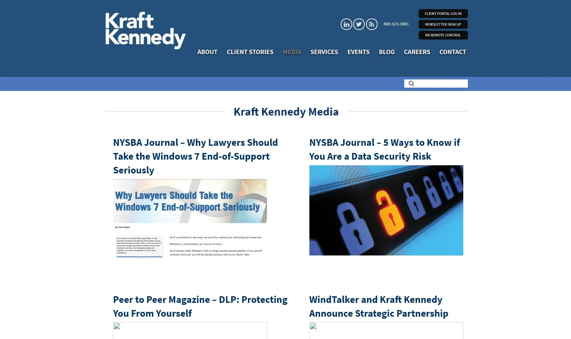
Articles Featured in Media Page, 2019
-
![]()
New Resource Hub, 2022
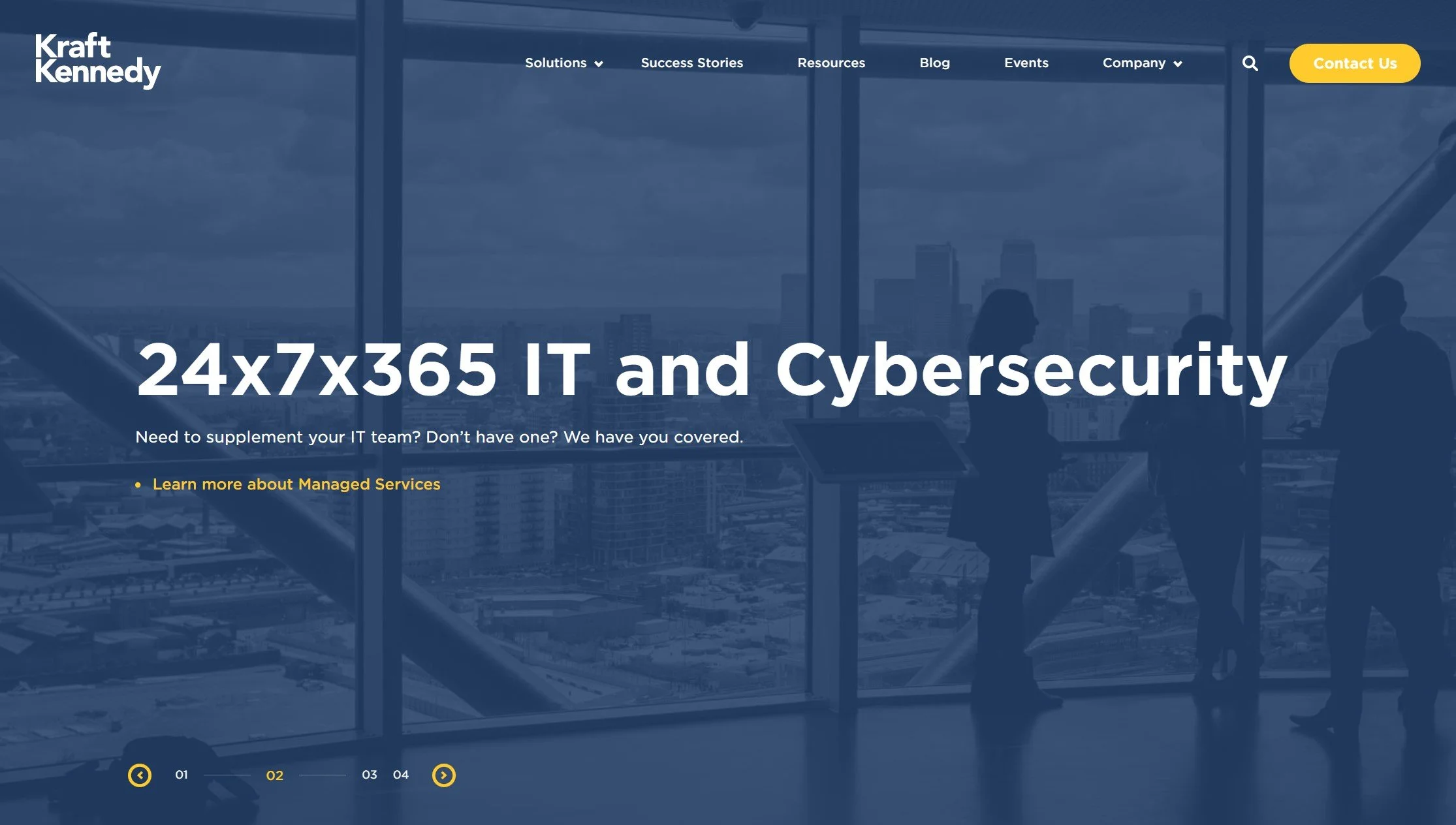
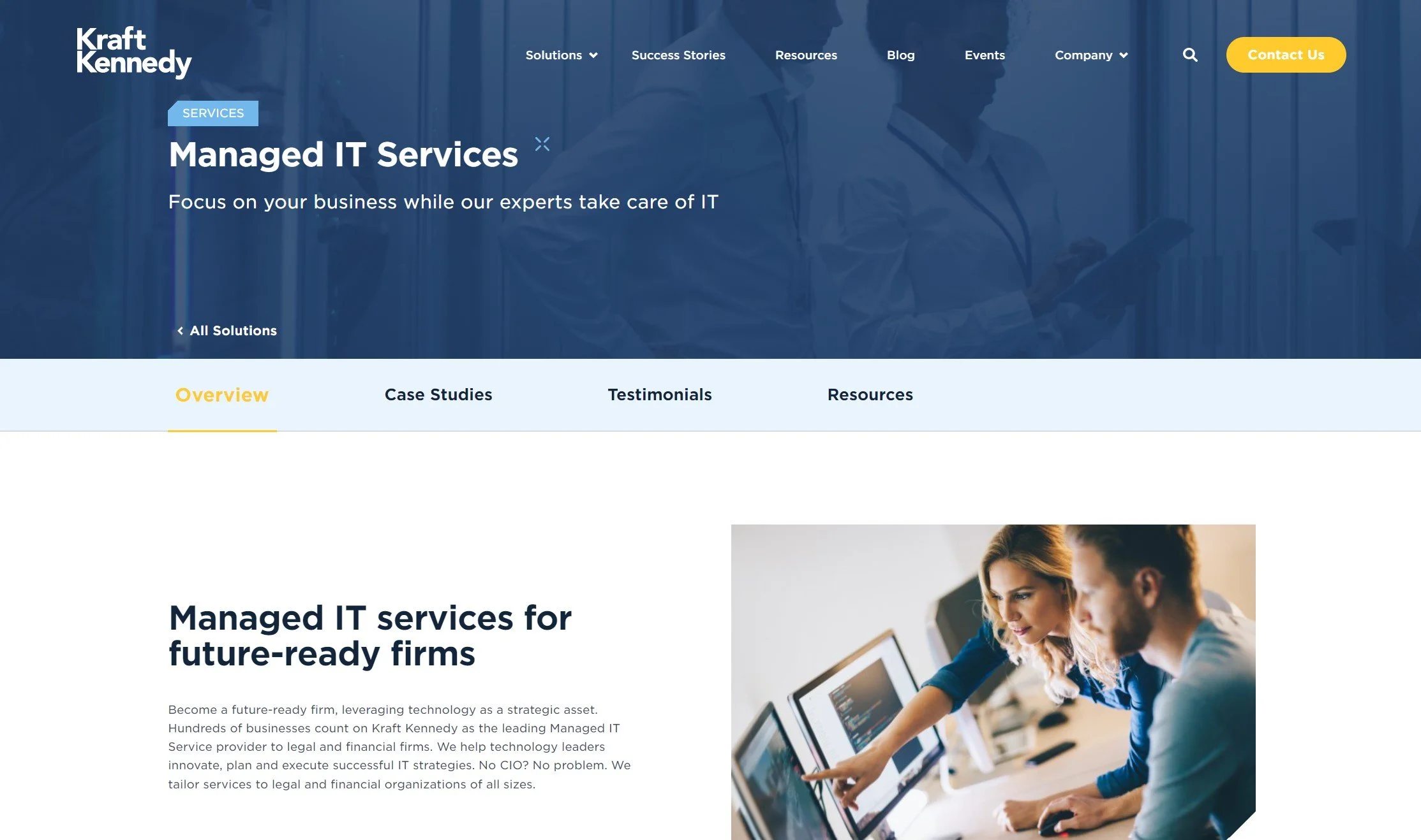
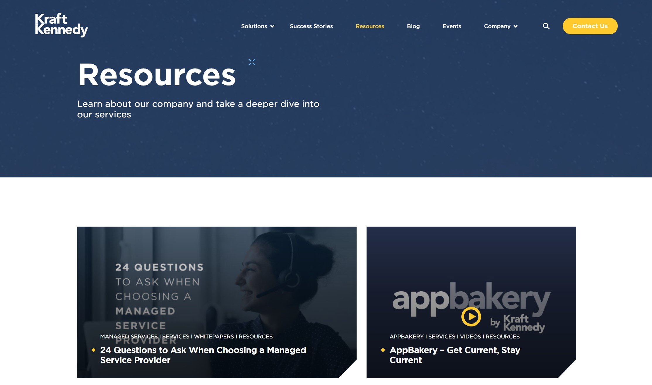
The renewed website is punctuated by bright, human-centric photography, modern iconography, and improved text hierarchy. The new Resource hub offers users centralized access to a trove of educational technical whitepapers and customer-oriented sales sheets. Additionally, contact forms are now placed in key areas around the site for increased lead generation, granting opportunities to reach out to the team with service demo requests or general questions.
Overall, the site breathes with a vibrant, professional energy of reliability and confidence and effectively showcases the capabilities of the company.
Project 3:
Kraft Kennedy University
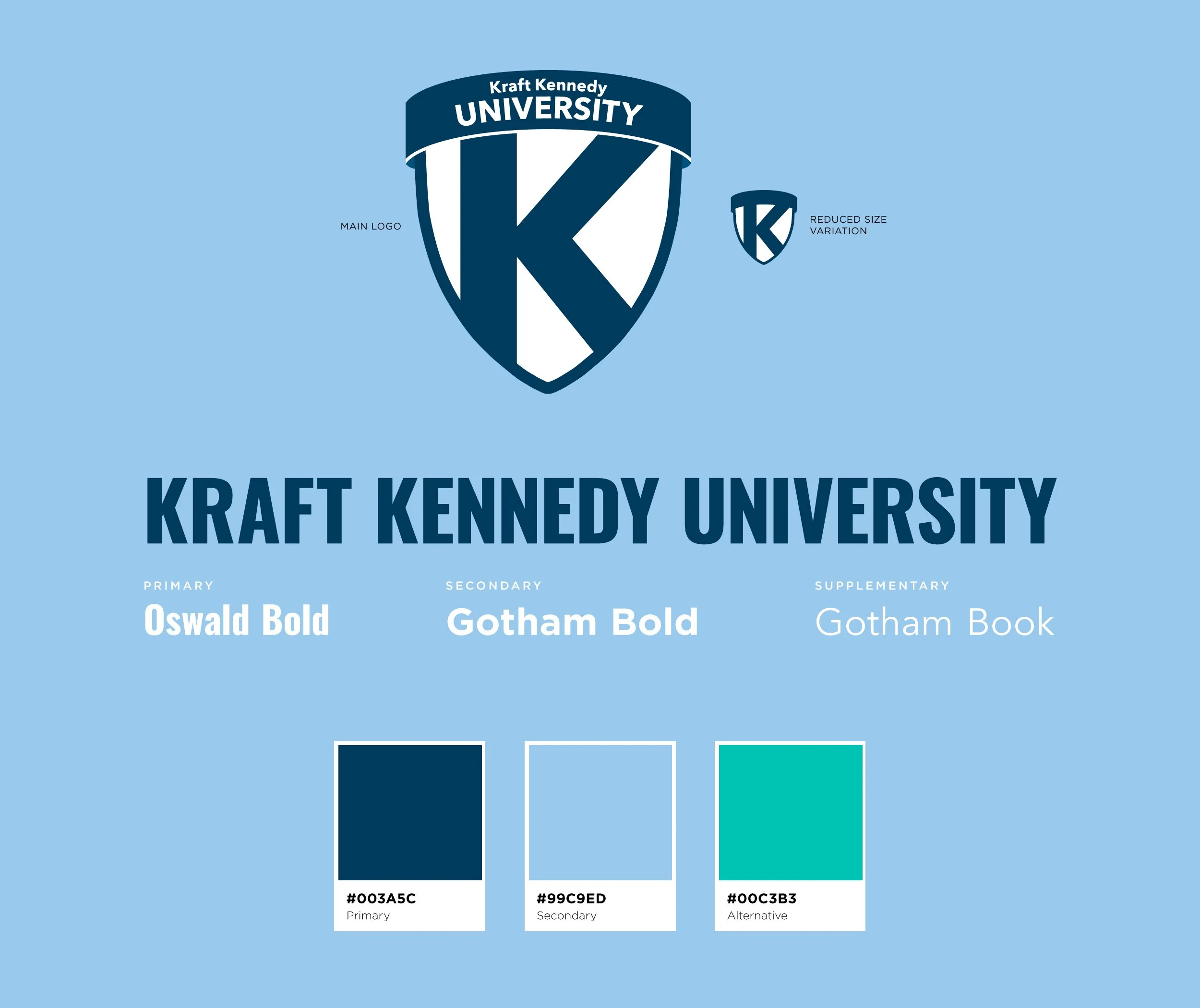
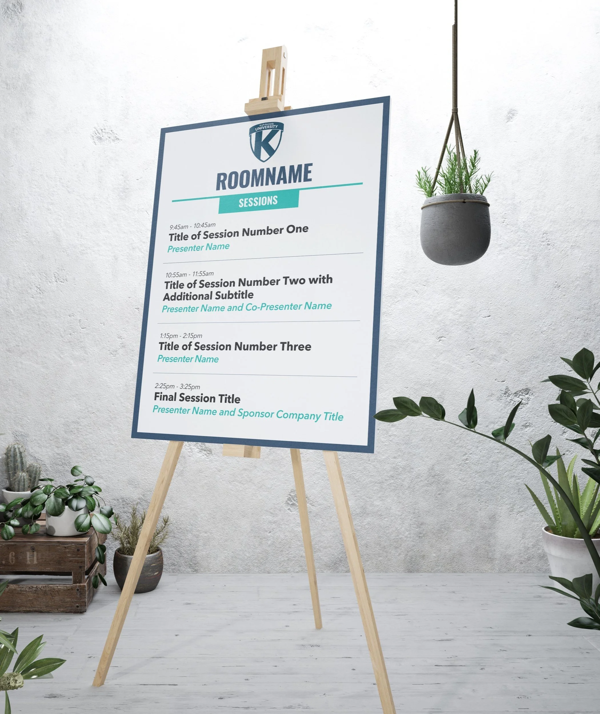
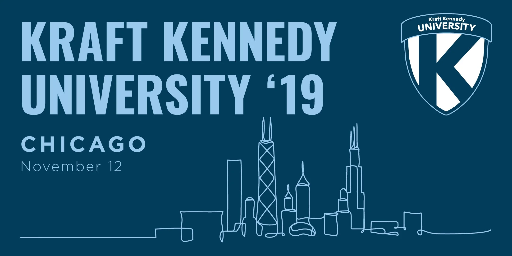
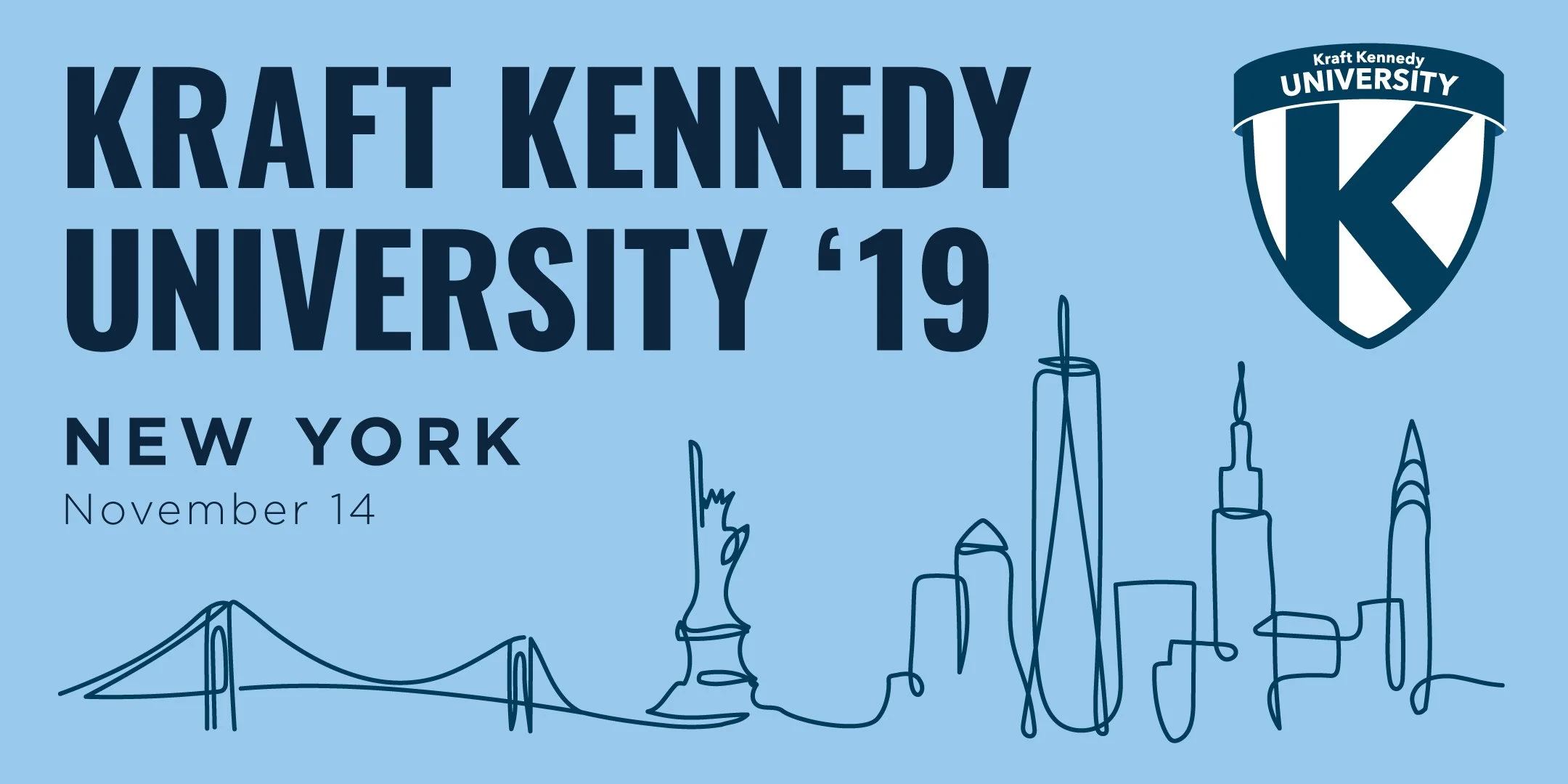
Kraft Kennedy University is an annual multi-city conference event series, delivering educational and strategic sessions from in-house experts and corporate partners on the latest in the legal technology landscape.
Having joined the team just before its first event in October of 2017, I participated heavily in the inception of the project, developing and manufacturing all visual assets relating to the branding, on-site environment, and online promotional campaigns for KKU.
Designed an original logo
Selected primary font and color scheme
Designed and coded (HTML/CSS) an informative landing page
Developed social media promotional campaign
Created and sourced large-format signage and paper collateral for on-site event experience
Participated in on-site management of event
Mockup PSD created by alexandercho
Cityscape graphics licensed from Shutterstock
Project 4:
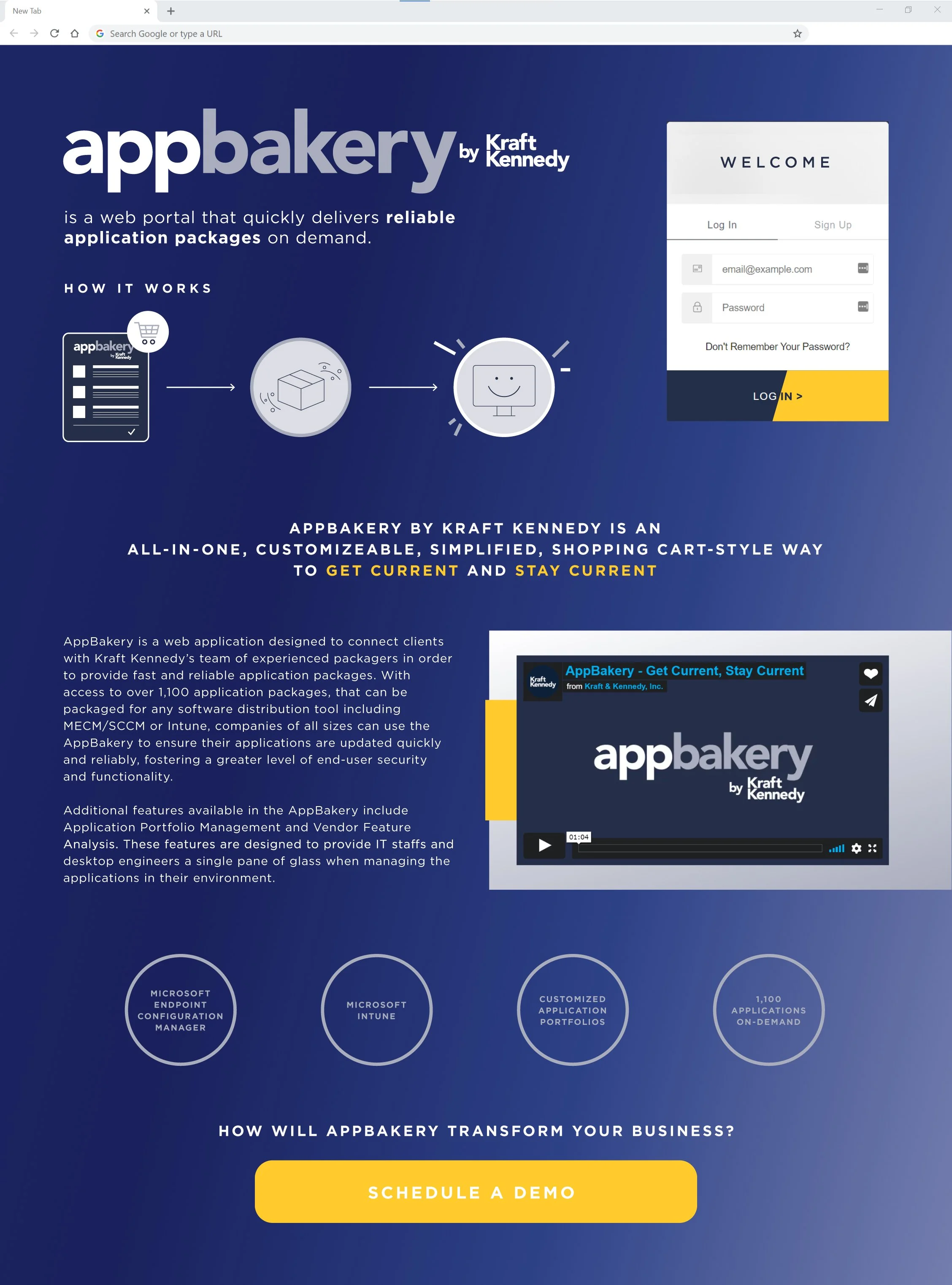
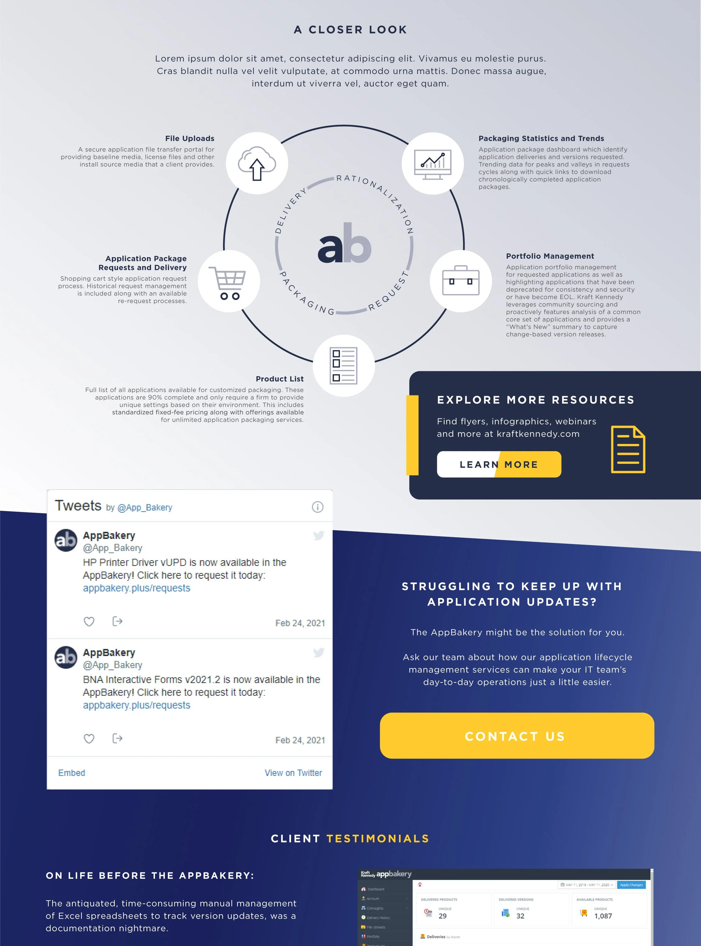
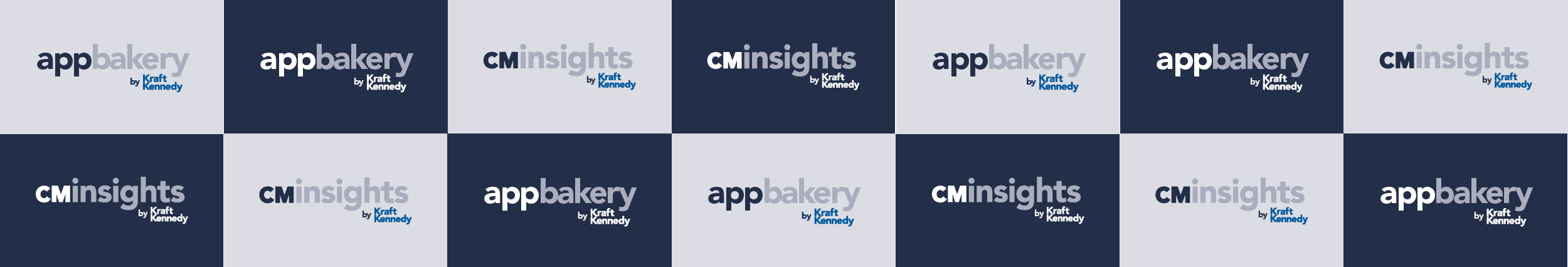
AppBakery and CMInsights
AppBakery and CMinsights are two original, industry-specific, one-of-a-kind application products developed in-house by Kraft Kennedy engineers. I worked closely with the development team to produce matching logos and color scheme to brand these solutions.
The products are utilized cohesively within the desktop management service.
AppBakery offers customized packaging and delivery of a selection of common industry-standard applications via a client-facing web platform.
CMInsights grants IT management departments in-depth insight into the status of their technical systems and Windows environments, as well as advanced reporting capabilities.
Early draft designs of adding a custom promotional landing page layout to the login screen for AppBakery.
This design expands on the original brand’s color scheme and utilizes the yellow action color introduced in the main Kraft Kennedy website redesign.
The slanted-fill action buttons represent a fade-on-hover effect.